

Allocation Report
Access this report
- Click the Metrics icon in the top/right navigation.
- Click on the section Allocation in the Metrics menu.
Use this report
The Allocation report helps you understand how your work is being allocated on your board to your team members, with the following options to display the data:
- Display Options to choose between card labels, priority, size, and custom fields
- Board Filters to filter the data by selecting which columns to include within each of our column states
- Card Filters to filter the data by the owner of the card, card labels, and custom fields
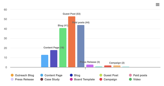
The Allocation report can display the chart in a pie or bar format.
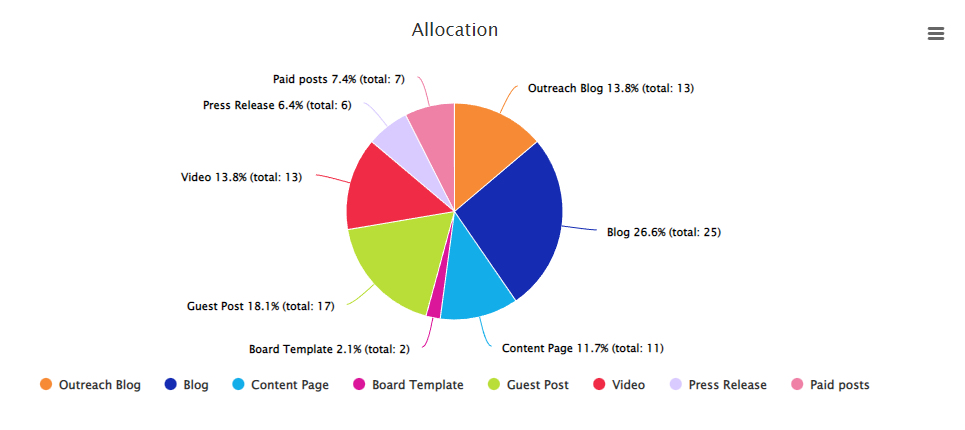
In the examples above and below, we show colored card labels that can be included or not in the report by clicking the label in the legend below the graph. To set up card labels that will show up on this report, you must create these colored card labels using the customize cards option for your board.
Show Detailed Data
From the Metrics left panel you can choose to display on the graph, the table, or both. When selecting table or both, you will see a table that works like our Table zone. This is where you can see all the data associated with the graph generated for this report and perform many actions to analyze your data. For example, you can group, sort, filter, pivot, and even create additional charts from this data. Be sure to select a few cells in the table and right-click to display a contextual menu with additional options.


