

This month we focused on making it easier to access key Kanban metrics with a single click, as well as multiple performance and interface improvements.
Quick Access to Kanban Metrics
The reports menu icon no longer just provides the ability to access your reports. When you click it, it displays the average Cycle Time and Throughput metrics for the last four weeks. You will also see colorful representations of your current Allocation of cards by labels and Flow distribution by column states.
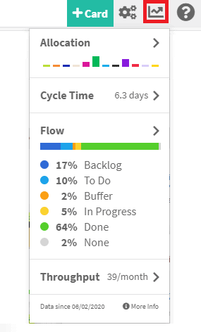
You can still click each of these 4 metrics to access the full reports and customize each visual chart based on your specific date range or filters. Kanban metrics are a key aspect of being a Kanban team, so we wanted to make it much easier to access these metrics with a single click.
Improvements & Fixes
- Added the ability to embed videos in the description of cards.


- In an effort to improve consistency across Kanban Zone we simplified the card edit screen and board editor top navigation.
- The next time you click on the Checklist tab on a card, you should see these get displayed faster. You should also notice faster loading of the Board panel and overall rendering of information on your boards.
- Lastly, we also upgraded our framework to display charts under the reports area. This is in preparation for revamping our reports area. Stay tuned…
As always, don’t hesitate to send us your feedback so that we can continue to improve Kanban Zone. You will never hurt our feelings if you find an issue or something that could be improved, so don’t be shy.
– The Kanban Zone Team


