

We have been adding a lot of features this year, so it was time to clean up the Add Card and View/Edit Card areas. You will notice small enhancements and interface improvements that we wanted to highlight so that you won’t be surprised the next time you add or open a card… These are subtle, but very helpful changes!
Add Cards from anywhere…
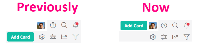
The screenshot below shows a very minor change in the Add Card button being moved from the local navigation (2nd row) to the global navigation (1st row). This means that you can now add cards from any zone, not just the Kanban and List zones.
In the screenshot below you can now also choose to add a card to the currently selected board, or choose a different board. This was necessary to add because the other zones (Calendar, Summary and Table) have the ability to show multiple boards, so it was key to know which board to add the new card to.
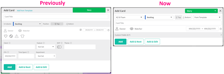
As you can see, the Add Card screen is now much smaller because we removed some signals (favorite, block, priority and size), which you can still use when editing a card; and custom fields are now collapsed by default.
Lastly, you will now always see the dropdown to create a card from a template. If you don’t have card templates set up yet, then you will see a link within that dropdown to create new card templates.
The goal was to make Add Card faster and simpler.
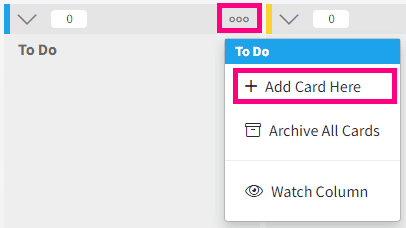
PS: Don’t forget that you can also add cards from any column on the board by clicking on the ooo menu and selecting Add Card Here.
Card Improvements
Since Add Card and the Card screen share many components, we also updated the Card.
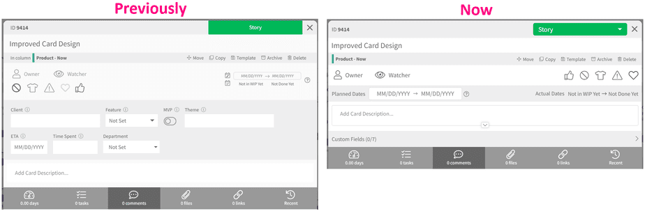
Here are the most notable interface improvements that you can see in the screenshot above:
- All the signals (owner, watcher vote, block, priority, size and favorite) are in a single line.
- Dates are in a single line with planned dates on the left, and actual dates on the right.
- The description and custom fields show collapsed by default.
- Blocked cards display in a very visible new red area. This is not shown on the screenshot above, but you will definitely see it when you block a card!
The goal was to make cards show everything about a card with no (or less) scrolling.
As always, if you find an issue or feel something could be improved, please don’t hesitate to send us your feedback so that we can continue to improve Kanban Zone. You will never hurt our feelings, so don’t be shy. We would love to hear from you because your feedback is important to us.
– The Kanban Zone Team


