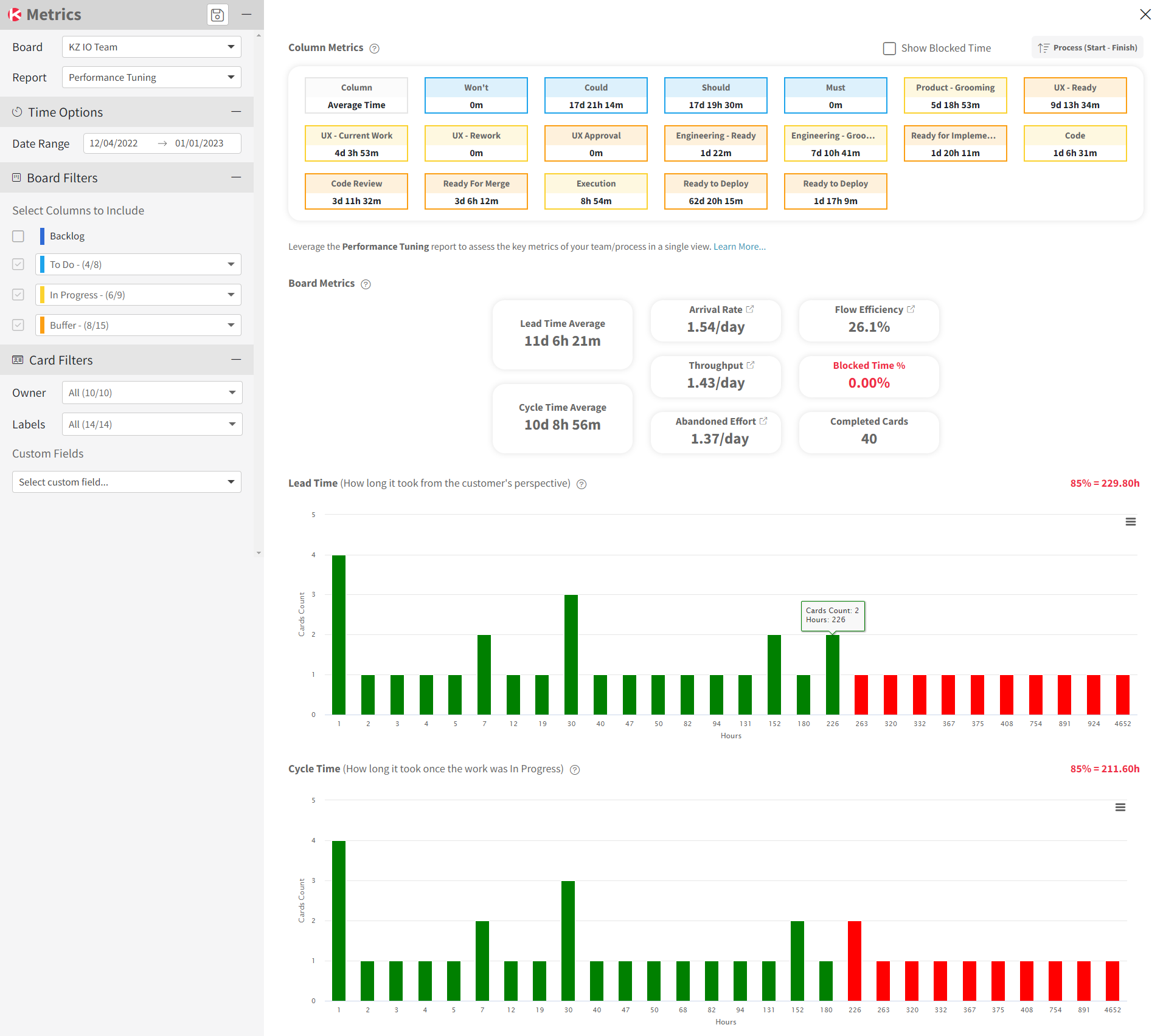
Performance Tuning Report
Access this report
- Click the Metrics icon in the top/right navigation.
- Click on the section Performance Tuning in the Metrics menu.
Use this report
The Performance Tuning report provides you with multiple metrics in a single view to quickly evaluate the performance of your team/process for a specific board, with the following options to display the data:
- Time Options to select a periodicity (daily, weekly, monthly, quarterly) and custom date range
- Card Filters to filter the data by the owner of the card, card labels, and custom fields

Column Metrics
This section provides a list of all the columns on your board with these 2 calculations:
- The average time spent by cards in each column during the selected period
- The plus/minus number of cards represents the difference between the number of cards at the end of the selected period vs. the number of cards at the beginning of that selected period
The columns with the highest average time should be ones to evaluate to seek ways to reduce the time spent in these columns as these can be considered as your bottlenecks.
Board Metrics
This section provides a list of key metrics for that board:
- Lead Time is the time it takes for a card to flow from leaving the Backlog to Done (To Do, In Progres and Buffer column states). This represents how long it took to complete the work from the customer’s point of view.
- Cycle Time is the time it takes for a card to flow from starting to work until being Done (In Progres and Buffer column states). This represents how long it took to complete the work from the team producing the work’s point of view.
- Arrival Rate is how many cards were added to the board.
- Throughput is how many cards were completed on the board.
- Abandoned Effort is how many cards were started but never completed on the board.
- Flow Efficiency is a way to represent how efficiently your cards moved on the board using a percentage.
- Completed Cards is the total number of cards that entered a Done column during the selected date range.
You can click some of these board metrics to see all the data used for calculating these metrics, as well as a chart to analyze these further.
Show Detailed Data
From the Metrics left panel, you can choose to display on the graph, the table, or both. When selecting table or both, you will see a table that works like our Table zone. This is where you can see all the data associated with the graph generated for this report and perform many actions to analyze your data. For example, you can group, sort, filter, pivot, and even create additional charts from this data. Be sure to select a few cells in the table and right-click to display a contextual menu with additional options.


