Track the flow of work.
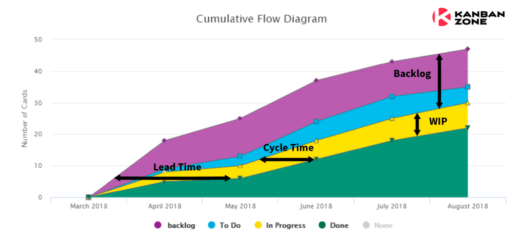
This graphical representation usually referred to as a Cumulative Flow Diagram (CFD) will provide a more holistic view of your entire workflow to better understand why your team is doing better (or not) over time. It also had the advantage to visualize many Kanban metrics at a glance like the size of your Backlog, Work In Progress (WIP), Lead Time, and Cycle Time.
Reading the chart requires to follow the changes in flow. Ideally, the Done work shown in green should continuously grow, but you must keep an eye on your Backlog shown in purple. A very simple and important concept to keep an eye on is the relationship between Backlog and Done.
Is your Done trend stronger than your Backlog trend?
Using the economic analogy of offer (Done) and demand (Backlog), if the Done is stronger than the Backlog, then the team is offering more than the market is requesting, which is good as long as the team doesn’t become idle by running out of work from the Backlog. On the other hand, if the Backlog is stronger than the Done, your team is not keeping up with the demands. This should cause meaningful conversations about increasing the size of the team or improving the way the team functions as a whole.
Stop patching issues downstream with quick fixes and temporary band-aids and instead understand your flow to identify the real problems upstream. By having a healthy flow of work, you will start seeing work get done faster and with greater attention to quality. Be sure to learn about the 3 Ms (Muda, Mura, Muri) from the Toyota Production System to create the ideal flow for your organization.
Learn more about this Flow report in this knowledge base article.


