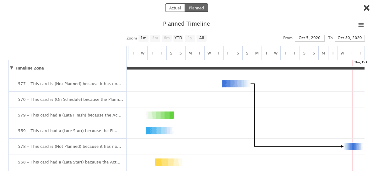
If you like dates then this month’s release notes should make you very happy… Timeline Zone is the absolute dream for a project manager seeking to track work within a Portfolio Kanban system. We also introduced Gant charts to visualize your work and polished some rough edges with rounded corners.
Timeline Zone is here…
If you wanted to track dates, create plans using these dates, and visualize these dates on a Gantt chart, then you will love our new Zone. Following in the footsteps of Summary Zone, you can target cards from one or multiple boards in a single view, but this time with a focus on dates shown in a timeline.
There is so much to share about Timeline Zone, including the ability to create dynamic plans, see the cycle time for each card, and get clear signals about work that needs your attention based on dates. You can learn more about this powerful new feature that you can access from the Board panel. For step by step instructions, check out this knowledge base article.
Gantt Charts
In support of Timeline Zone, we added the ability to view cards on a Gantt chart. This common project management view of work will provide you a way to track cards based on their planned or actual start/end dates.
Important Note: Since many Kanban Zone organizations use a Portfolio Kanban system by linking cards across multiple boards based on their relationships (parent/child or predecessor/successor), you can also generate a Gantt chart under the Links section of your cards.
A great example of using a Gantt chart on a card is if the card represents a project and you have linked all the deliverables of that project to other cards. Clicking the “Gantt View” button will generate a full picture of where all your cards stand on a timeline.
Rounded Corners!!!
If you have been using Kanban Zone for a while you might have noticed a subtle recent change… cards and popup windows now have rounded corners. You are not crazy, we did soften the look of Kanban Zone by introducing these slightly rounded corners.
Why the change? Well, first-time user’s feedback consistently wondered why was everything in Kanban Zone so square. We took a fresh look and when we tried the rounded corners on cards it felt good. We hope that you feel the same and enjoy this small change to lighten up your experience.
As always, don’t hesitate to send us your feedback so that we can continue to improve Kanban Zone. You will never hurt our feelings if you find an issue or something that could be improved, so don’t be shy.
– The Kanban Zone Team


