As we get everything ready for the improved Kanban Zone navigation needed to introduce the new List view, we have a couple of enhancements to share and a verbiage change…
The first enhancement is about providing the ability to rename existing attachments. The second, is to offer a better way to view all the boards. Lastly, we renamed the blue column state from “Start” to “To Do”.
Rename Attachments
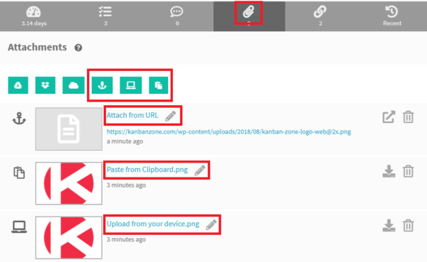
Kanban Zone provides the ability to attach files to cards, and now you can rename attachments uploaded from your device, a URL, or pasted from your clipboard.
Since the other types of attachments from cloud services like Google Drive, Dropbox and OneDrive do not really attach the file, but syncs with your files on your cloud services, we did not provide the ability to rename these ones.
Improved Board List
In preparation for the new Kanban Zone navigation, we are cleaning up the board lists in the board panel and under your organization settings.
This change offers more information about the boards you can access within an organization, and shows your role for each board. You can click any rows to open the corresponding board.
There will be more changes coming to this screen, including the ability to set your organization logo, so that it can be displayed in the upcoming improved navigation. Yes, we know this is very exciting!
Renamed “Start” to “To Do”
The current blue column state “Start” has been renamed to “To Do”, which is more fitted for cards that are no longer in the Backlog, but also not in WIP yet. The word “Start” implied that these were all starting, where the words “To Do” reflects the more appropriate state of next cards in line to pull into the board.
This is a only a verbiage change that does not modify any functionality and will not have any impact on your metrics.
Updates about the upcoming List view…
We have started the development of the new navigation to welcome the new List view. Below is a sneak peek based on our current design, so things could still change, but all the elements are there.
Switching between your Zones will be very simple. You can see highlighted in red the new List that will also offer the ability to do bulk actions. The grey K icon will be your organization logo as shown prior to uploading your actual logo. Another great improvement will be the quick search to filter your Kanban or List by typing a title or ID of a card just like you can already do in the Summary and Timeline zones.
We are looking forward to launching this navigation, followed shortly by the List zone. So get ready for more ways to focus on the right work.
As always, don’t hesitate to send us your feedback so that we can continue to improve Kanban Zone. You will never hurt our feelings if you find an issue or something that could be improved, so don’t be shy.
– The Kanban Zone Team


